Top Online Resources for Designers and Creative Directors
I’ve shared the top Mac apps I use to enhance productivity as a designer and creative director, but now I’m sharing my favorite browser-based resources that will hopefully help you in your creative career to make more compelling designs that stand out from the rest. I’ve also included two must-read newsletters into this stack of resources because they are consistently the newsletters I read from beginning to end each week.
Let’s get into it.
Resources for Better Moodboards
Far too often, I see mood boards assembled solely from visual design references from other designers and existing brand identities. I attribute most of this to oversaturated Instagram feeds and Pinterest boards. When creating a mood board, your goal should be to create a feeling, an energy, a ‘vibe’ that all the elements of a brand expression can originate from. It shouldn’t just be a sample of typography and color to mimic in your design or visual identity.
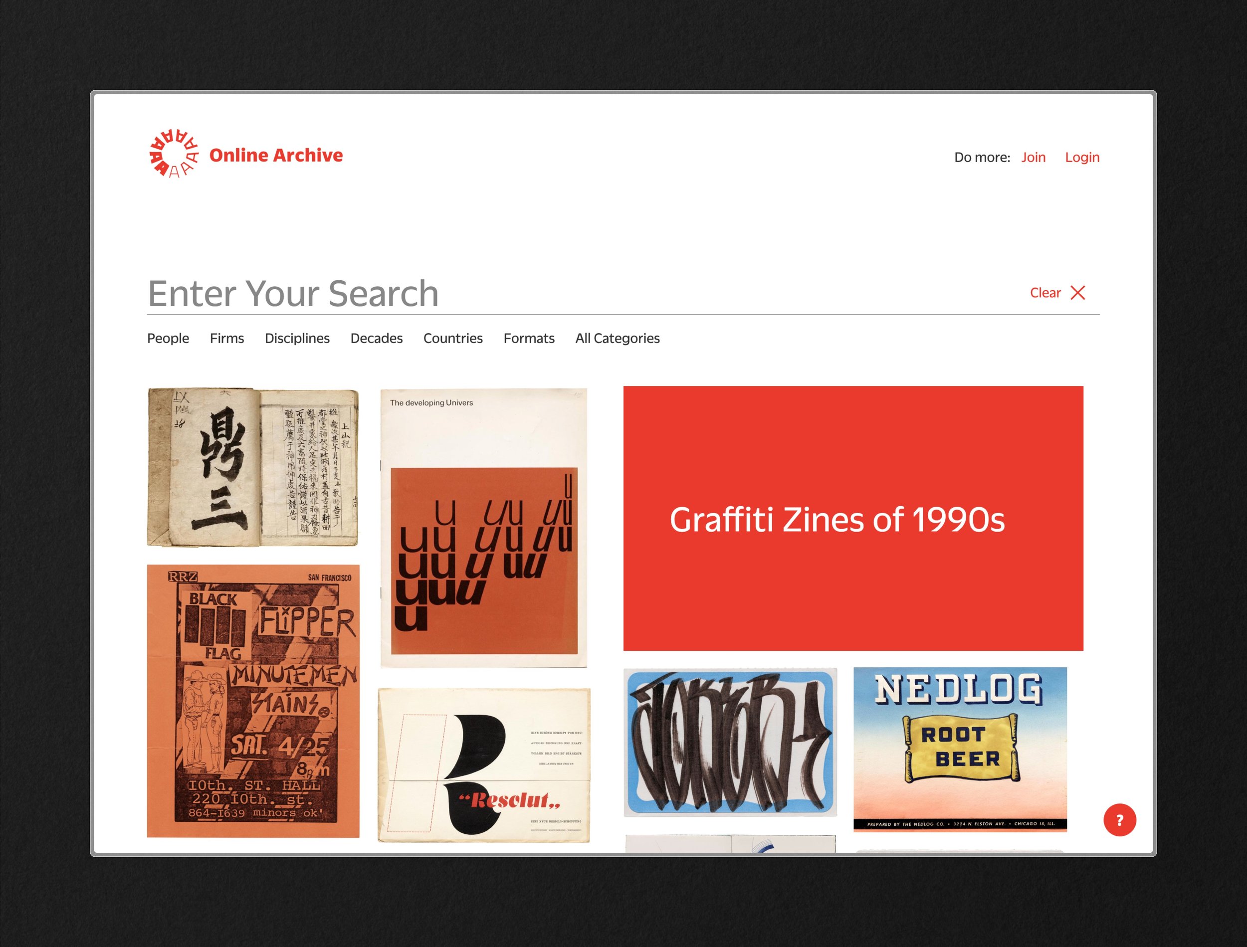
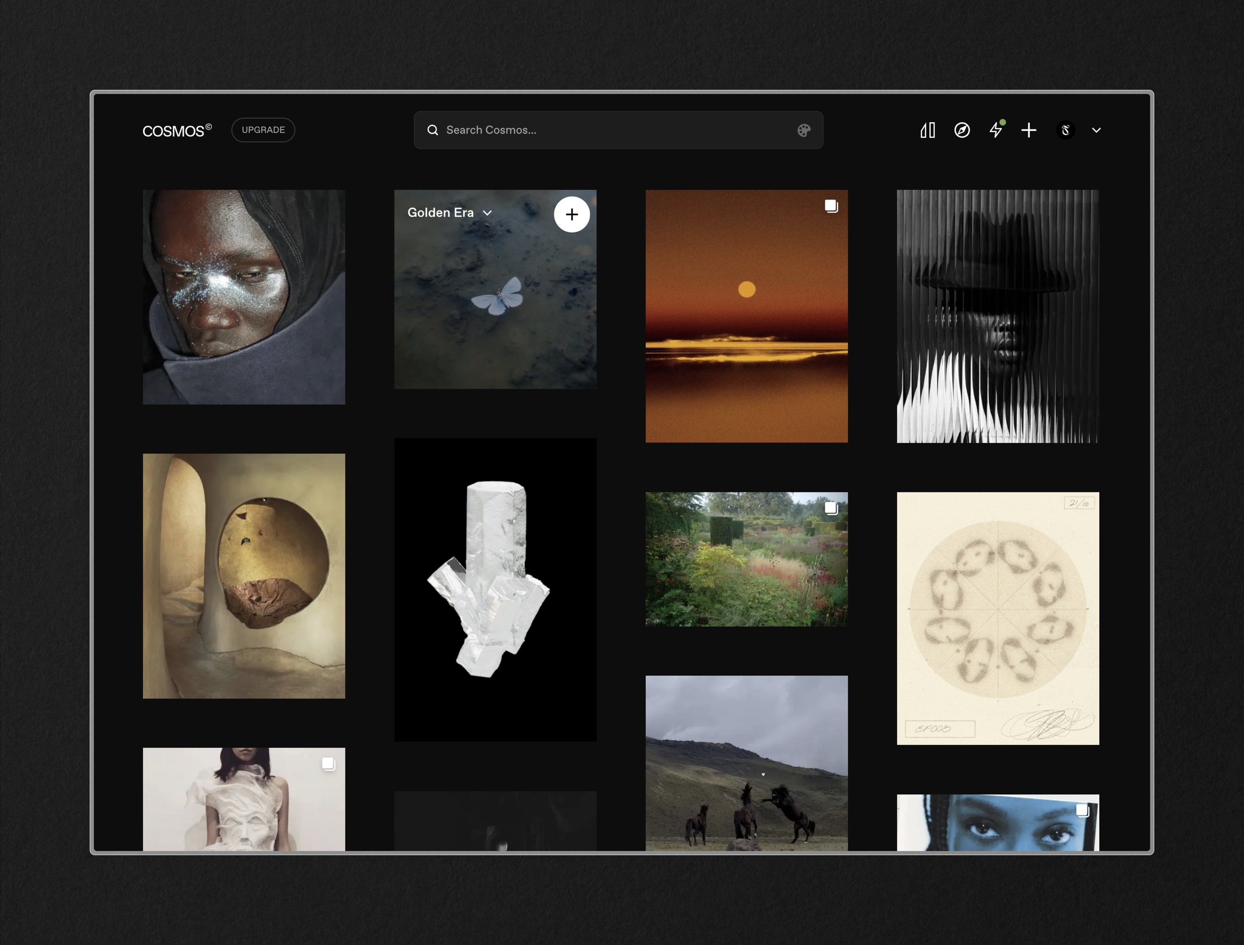
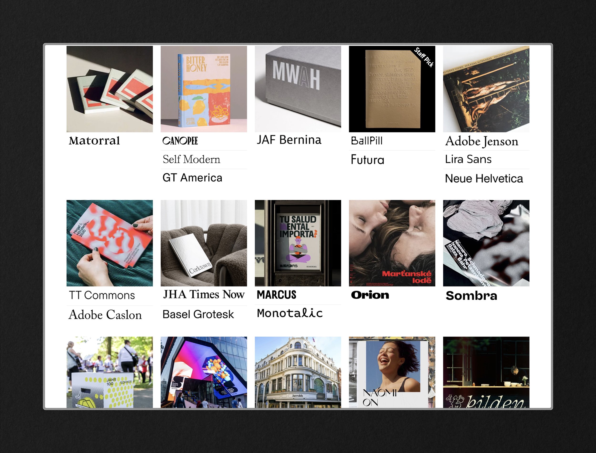
This is where Letterform’s Online Archive, which is full of public domain imagery samples, and Cosmos, a better Pinterest, come into play. The former primarily showcases typographic treatments across disciplines and decades (and other filtering functions). Using these samples as they are in mood boarding or by extracting the type, you can generate more unique custom typographic treatments for consideration. Cosmos, on the other hand, is what each user makes from it. You can certainly add your own inspiration by uploading or collecting from the uniquely curated content already found on the platform. Using the more raw and under-sourced imagery from Cosmos will help your mood boards convey an idea through texture, shadow, color, and composition rather than other design samples.
Resources for Better Typography and Color
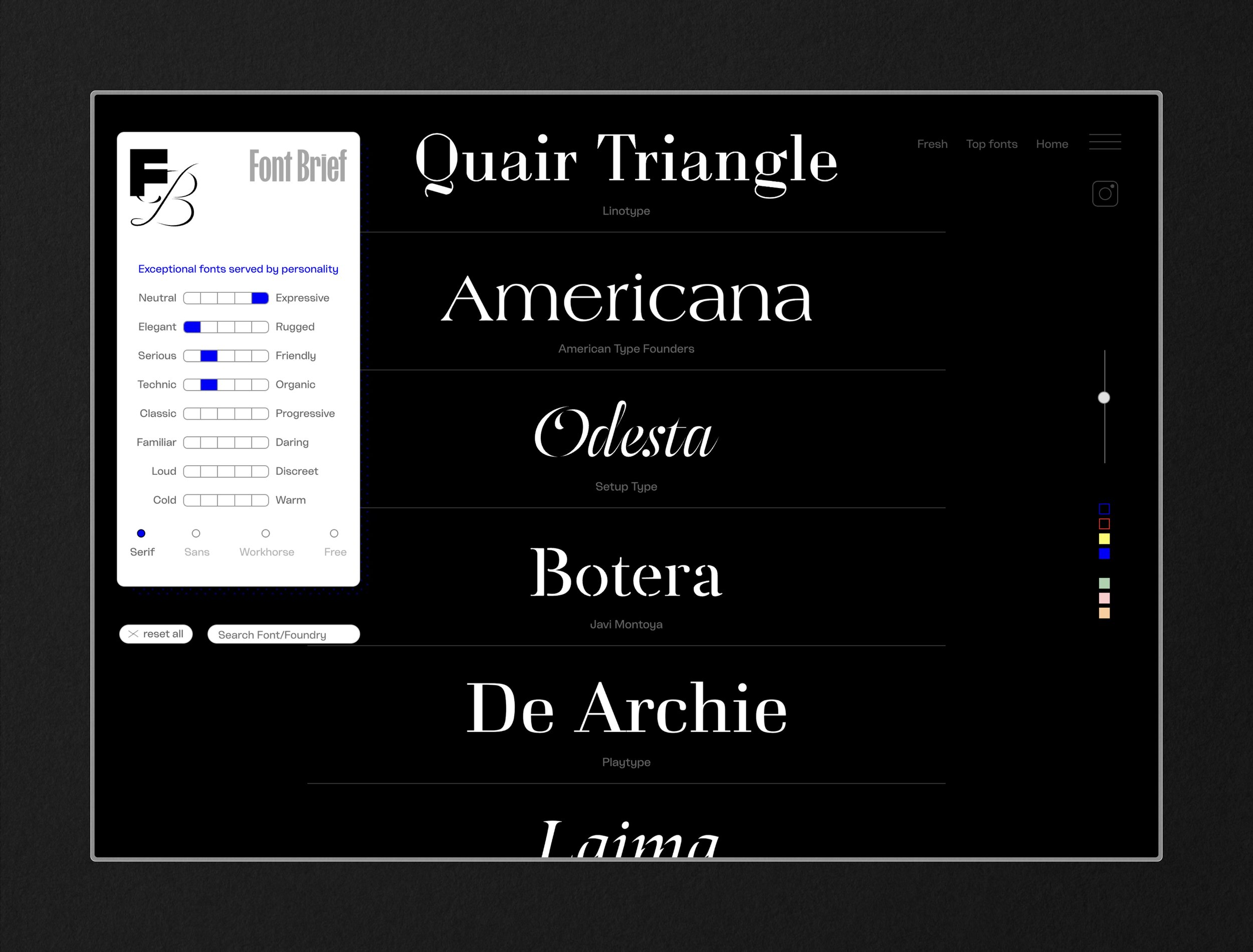
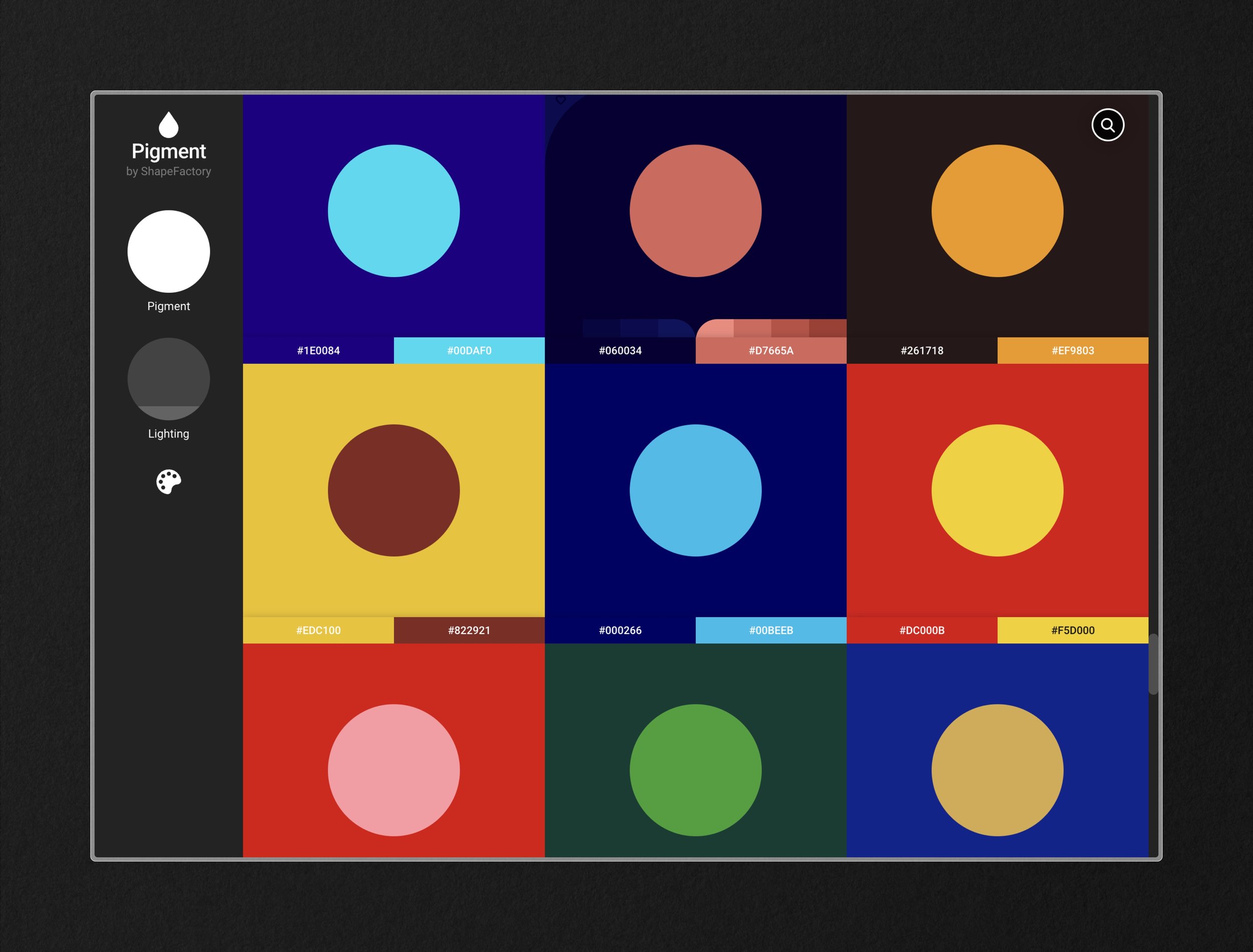
This goes without saying, but some of the best designs I’m sure we’ve all seen are the designs that let the typography and color of the design shine through. That said, not all colors and fonts are worth shining the spotlight on. Using Font Brief can be a fun and creative exercise to do on your own or with a client to help get aligned on how they view certain styles using the traits as the filtering function. Pigment by Shape Factory is one of my all-time favorites for generating unique color pairings. With intuitive lefthand adjustments for lighting and pigment, the possibilities are nearly endless. Then, using Fonts in Use is a perfect way to get ideas for composition and scale when applying your type selection from Font Brief and your palette from Pigment.
Newsletters for Designers and Creatives
If you’re like me and prefer to end the day at ‘Inbox Zero’ then subscribing to a newsletter means it better be good.
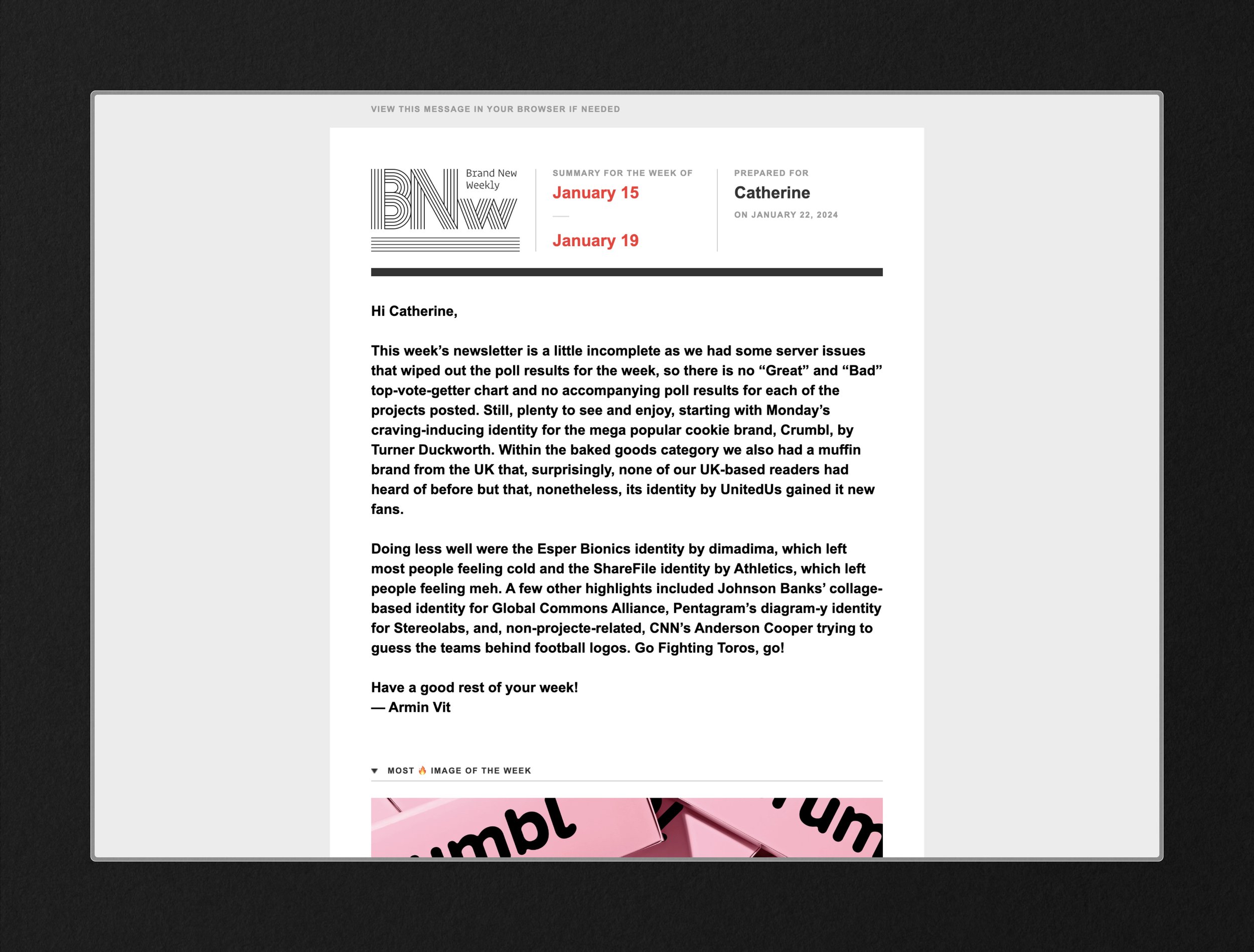
Under Consideration’s Brand New Weekly is an industry must-have for anyone working in the design and branding space. The newsletter itself is always extraordinary, with great insights from Armin (the curator) and a consistent, scannable layout. The real richness comes from the community comments and discourse on each featured project. You will need a subscription to access the full brand identity reviews and comment section, but they’ve priced it at a minimum of $20/year. However, if you can pay more, you should — the value is there. My preferred method is to enjoy it with a cup of coffee on Monday mornings set to Do Not Disturb.
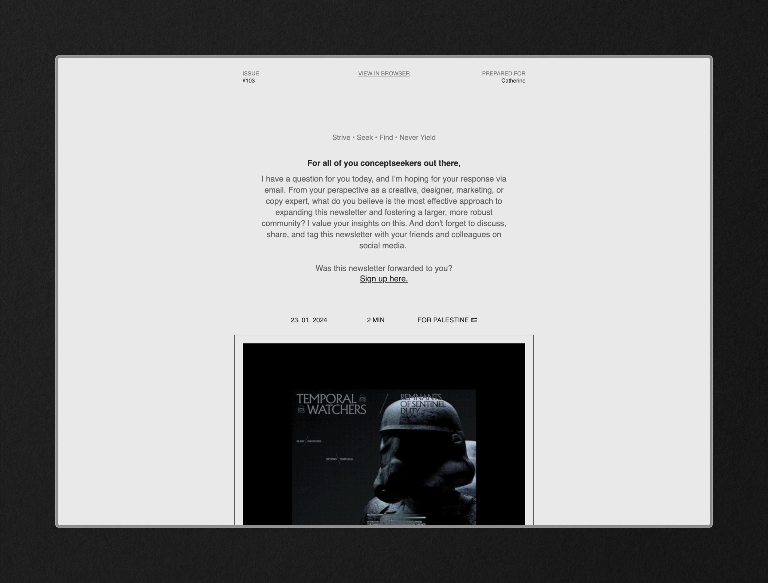
Conceptseeker is a newer weekly one I’ve been subscribing to, but it's just as valuable. The content appeals more generally to multiple creative disciplines with a slight focus on UI/UX design. The content features just five short sections that are jam-packed with intrigue, from more online resources like the ones I’m sharing in this article to inspirational quotes to design tips and tricks. It’s usually a guarantee that I end up with four or five more tabs open because of it.
Design in action inspiration
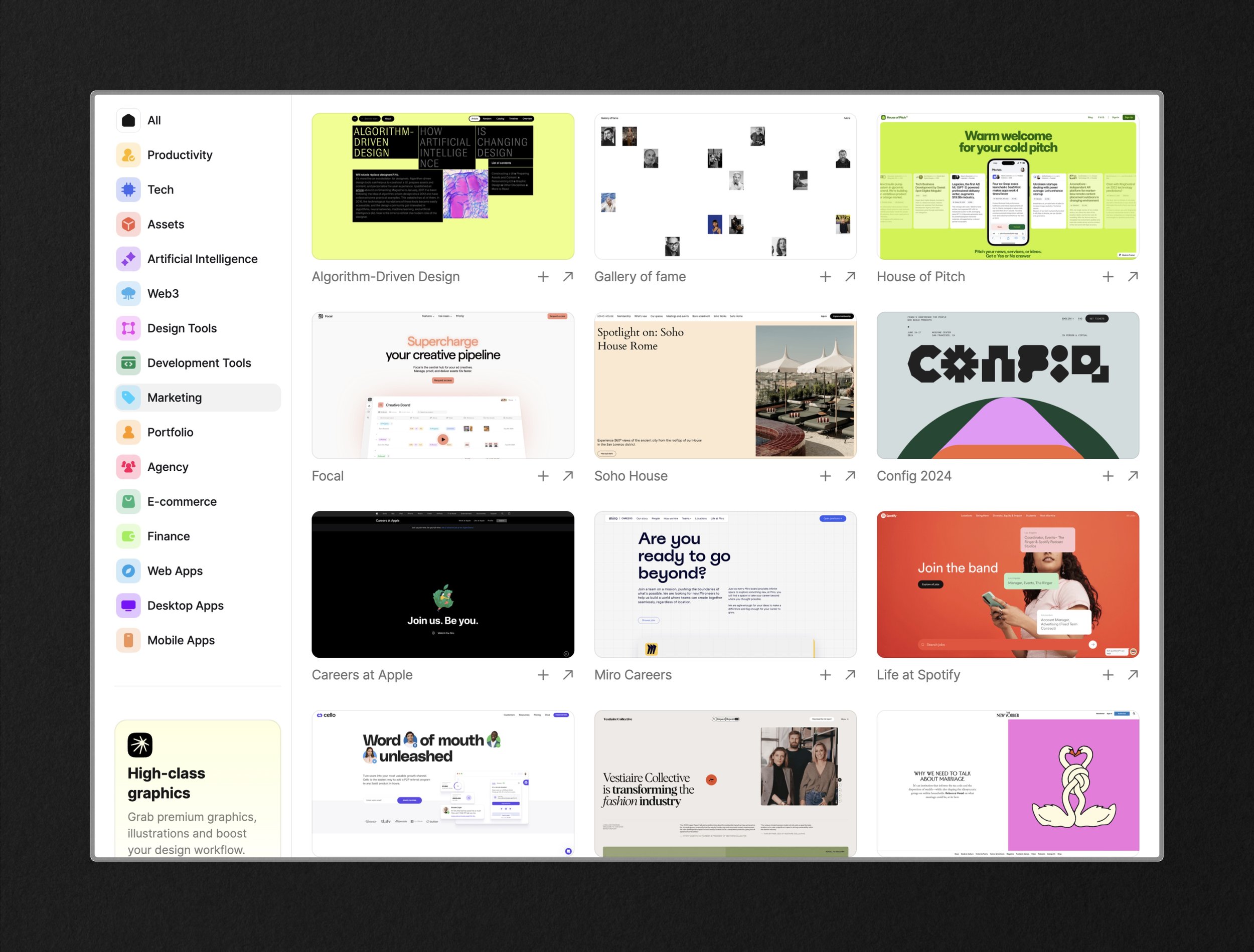
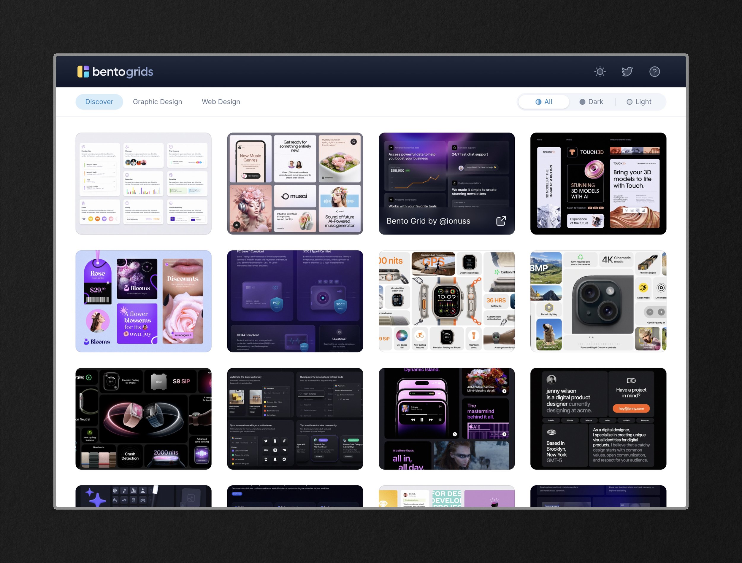
Seeing overly polished case studies on Dribbble and Behance that may or may not (probably didn’t) pass final client reviews can feel like they miss the mark for design inspiration. That’s when I turn to Curated.design and Bento Grids. If you’re sick of seeing bentos, then you can ignore that one but don’t miss Curated.design. Bentogrids is great for getting at-a-glance reviews of style applications and they also filter by general graphic design and aren’t exclusive to UI concepts. Curated.design, however, is the definition of judging ‘above the fold.’ They also have a weekly newsletter to get the inspiration directly to your inbox if you prefer that.

